Art Holiday Accommodation in SW France Details

Saturday 31 January 2009

INTRODUCING YOUR NEW BEST FRIEND


What happens when a sportsperson gets injured and can't play for a while? Well, they invariably loose their edge. A tennis or golf player just back from injury always struggles to regain form.

It's the same with drawing, which, you've seen from previous entries, is a vital ingredient when it comes to picture making.

What's the answer? That's easy - draw every day.

The best way to achieve this is to always have a sketch book with you. Then, when you're stuck at the airport, waiting for someone in the hotel lobby, or waiting for your spouse to bring you breakfast in bed, you can make productive use of your spare time. So whenever you've got a few free minutes, start drawing.

As your sketchbook will be with you so much, you should choose a good size (A4 is far too small). Let's say about A3, and a reasonable quality stock, and certainly more than 100gsm.

Now all you have to do is aim to do a sketch a day.

WHY NOT MAKE YOUR NEW BEST FRIEND YOUR SKETCHBOOK?
I promise you you'll never regret it.

Two of the drawings above are from my sketch book - one is of a pair of runners. I did this when I was rafting down the Franklin River in Tasmania. The other is a sketch done in a nearby town when we were looking for a house in France. The third is a more finished drawing of Lynne and an amazing building in Melbourne.

* HOW TO PAINT A WINDMILL


Let's go through the process of painting a windmill, step by step.
1. First find a windmill. (There's one quite near La Petite Galerie).
2. Look at it carefully for a while.
3. Think about what you are going to keep in and emphasise and consider what you're going to leave out.
4. Draw a border around a decent size/quality sheet of watercolour paper.
5. Draw the windmill, paying careful attention to the POSITIVE and NEGATIVE SPACES. (This will help you capture the windmill accurately on your paper).
5. Paint your windmill.
6. Don't forget to sign and date your painting.
Like to try this for real? If you like, I'll take you to the windmill, provide you with all the materials you need and then take you through the process, step by step and face to face.
And for the rest of the week we'll go on to paint in several wonderful villages in this beautiful part of France.
Why not consider an art holiday at La Petite Galerie? For more information go to the link at top right on this page.

* "LE VILLAGE EN ETE" - "THE VILLAGE IN SUMMER"


The days are hot, the grapes are ripening, and there are sunflowers everywhere. In the square, you’ll hear the crack of iron balls – the daily game of petanque is in full swing. At the bar, some customers seek refuge from the sun and enjoy a pression in the shelter of the medieval arcades. The more adventurous are sipping an apero en plein soleil on the terrace while watching the colourful country produce market that comes to the village twice a week. This is Gascony in midsummer, and the village is Mezin. Some call it la France profonde, but I prefer “secret France” because this is the France you won’t find in any tourist books. It certainly is a haven of peace and tranquillity – even at the height of the tourist season.
It’s some of these evocative sights and scenes that I tried to capture on canvas in an exhibition ‘Le Village en Ete’ I had in the Tourist Office a few years ago. The subject of the paintings was summer in Gascony: sunflowers, pigeonniers, petanqueurs and some of the most beautiful villages in France.
Some paintings show the colourful village characters who play, watch and comment on the game, the petanqueurs and their skills. When I play petanque (which I do most afternoons), I always feel that everyone of the players could be from Central Casting on their way to shoot a scene for a Monsieur Hulot film. And I love them all.
In this area, pigeonniers literally pepper the countryside, and I’ve done quite a few paintings of these strange and beautiful buildings that in days gone by were a symbol of status and wealth.
Several of these paintings are now on show at La Petite Galerie in Mezin (47170), a medieval hilltop village in FRANCE. It’s where Lynne and I have made our home, and it’s like living in Paradise. I hope I’ve captured some of this atmosphere in my paintings.
You can see a few of them at
www.johnstonesinfrance.com

Drawing Exercise 3


Here’s something to think about.
It's designed to force you to concentrate on the NEGATIVE SPACES IN YOUR COMPOSITION.
Choose a piece of fabric with a bold all-over pattern.
Position a mug and a jug (or similar items with handles) on it so that you can see the fabric through the handles of both items.
On a good quality piece of paper (because you'll be sketching with some vigor), and if possible a piece larger than A4 (because you'll want to keep this exercise for posterity), draw a border about 3 cms wide.
Now draw only the outline of the solid objects, but draw and then shade the PATTERN you can see on the cloth as strongly as you can and in as much detail as possible, leaving the objects blank.
Use HB, 2B and 3B pencils if you like, but whatever you choose, use your pencil/s to "paint" the pattern on the fabric so that it becomes the SUBJECT of your sketch. (You will probably want to simplify the pattern).

Friday 30 January 2009

* A LITTLE BIT OF THEORY - 5


THE MAKINGS OF A PICTURE

Think about composition as a language used to discuss how a work of art is made up. Pictures are composed of various elements or components which, when considered together are known as composition.

When creating a picture, some artists have an intuitive sense of composition, some plan their compositions, and some will deliberately manipulate or change certain principles in order to achieve a specific result. What results at the end of these various processes is the composition of the work.

The picture plane is the two dimensional surface of the picture. When you look at a work of art, in reality, all you see is this surface and what’s on it. Visualise the picture plane as a window into the picture.

Balance is probably the most important part of the composition, although a lack of balance should not necessarily be thought of in negative terms. If there is a feeling of visual balance or harmony, the composition is considered classical, if there is a sense of disharmony - or an unbalanced feeling - the composition is usually referred to as romantic.

A simple way to think about balance in a composition is to imagine the picture on a scale - or with the fulcrum running down the middle - if your impression is one of harmony, with the elements, forms, colour, etc in the left half of the picture creating a feeling of being roughly equal to those in the right of the picture, or if the work has a feeling of alignment or symmetry, the work is considered to be in balance.

FOCAL POINT

In most works of art, there is usually a focal point. This simply means the most important part of the painting, and the area where the eye is led by various components of the composition (and where the eye usually comes to rest) whether they be line, perspective, shape, form, colour, texture, etc. In the painting I did of the nearby village of Nerac (above) the eye is led by perspective lines towards the ARCH in the bridge, which is the focal point.

In some paintings, the eye is led very quickly from one point to another by their repetition of similar shapes or colours. This is known as rhythm.

The Golden Rule of composition is a theory that states that the most pleasing place for the focal point to be situated is approximately one third the way along an axis within the composition where the axis is one third from the edge of the work.

* 20 GREAT YEARS IN AUSTRALIA


Ray Johnstone was born in South Africa (1943) where he obtained a Bachelor of Arts degree in Fine Arts, majoring in painting, drawing and sculpture, and where he participated in numerous group shows, including several at the prestigious Total Gallery in Johannesburg.
One of his large nudes in a Pretoria University exhibition created a controversy when a screen had to be erected around the painting to prevent it being seen by the South African Prime Minister John Vorster.
While living in Australia, he had seven solo exhibitions in Melbourne, and in 1997 he won the Applied Chemicals International Acquisitive Prize for a watercolour of a Victorian factory building in Melbourne. Australian radio personalities Terry Lane and Doug Aiton both have portraits done by Ray Johnstone and his works are held by private collectors in France, Hong Kong, the USA, Canada, the UK, Australia and South Africa.

2000 ‘Paint France’ Alliance Francaise, St Kilda, Melbourne
1990 ‘Melbourne Icons’ Art Affairs Gallery, Carlton, Melbourne
1998 ‘The Centre and the Sea’ Disegno Gallery, Southbank, Melbourne
1997 ‘Ships, Flowers, Faces, Places’ Customs Wharf Gallery, Melbourne.
1995 ‘Flowers, Faces, Places’ Roar 2 Studios, Fitzroy, Melbourne
1993 ‘Nudes, & Portraits’ Roar 2 Studios, Fitzroy, Melbourne
1991 ‘Adam & Eve and Other Nudes’ Roar 2 Studios, Fitzroy, Melbourne

1978 - 1990 Various group exhibitions in South Africa and Australia

Ray and his wife Lynne now live permanently in Mézin (Lot et Garonne) France, where they run a gite and a gallery and where they offer live-in painting holidays.

If you'd like to see some of my Australian paintings, please go to
http://www.johnstonesinfrance.com/Paintings/Pages/Home.htm

Thursday 29 January 2009

* A BAGUETTE IS MUCH MORE THAN A LOAF OF BREAD


Above: THE VIEW FROM RAY'S STUDIO, WITH THE BAKER'S BUILDING OPPOSITE

FRENCH BREAD
It does not take long for Anglo Saxons who live in France to realise that the French have a unique attitude towards bread. And in no time at all we all succumb to French ways.
Even buying bread in France can offer a bewildering feast of options for foreigners. What to choose is always a problem. Baguette, ficelle, flute, batard or one of the many other wonderful French breads? All are different, all are wonderful. Needless to say, the pastries and croissants are to die for, and choosing only one each is often the biggest problem of the day.
When we lived in Australia, I probably had one or two slices of bread per week, but here in France we have a fresh baguette with every meal. And there’s always a crisis at noon when the siren goes off, if we’ve forgotten to get our lunchtime bread. Someone has to hare off to the bakery and join the queue of French people who have also almost forgotten their fresh supply of the “staff of life” for their midday meal.
In fact, the idea of keeping bread is almost foreign to the French, and even small villages often have several bakers to choose from – here in Mezin we have four.
From my studio on the third floor (above) you can look out over the baker’s rooftop towards the 12 th century church of St Jean Baptiste at the heart of the village. This view of the bell tower and the Renaissance bakery has fascinated me since we bought the house ten years ago, and I’ve done several studies of the bakery and the church. In one, the baker himself dozes outside his front door as he waits for his bread to rise. In another he’s seen carrying the fresh baguettes up the street to the baker shop. In a third a customer waits patiently for his loaf.
One of these paintings was bought by a couple from Hong Kong. Julian and Karen live in one of the towers high up on Victoria Peak on the Island. This means that when they sit in their lounge, not only do they look out across the bay towards Kowloon, but on their walls they can look across the rooftops to the medieval church of St Jean-Baptiste in Mezin, France.

* PASSION FOR PIGEONNIERS


Everyone loves the pigeonniers in SW France

Sooner or later our guests ask to paint a pigeonnier. Here are some of them hard at work en plein air.

(I’ll provide some information on these amazing structures in a later posting, but as a teaser, at this point I'll tell you that before
the French Revolution in 1789, only the King, the nobles and the clergy were permitted to own them).

Wednesday 28 January 2009

* WHAT ON EARTH IS A PIGEONNIER?


Pigeonniers have become a painting passion.

Ever since I first saw these intriguing sentinels on my travels around France, I have painted dozens of them, and I now always have a few of them on display at my gallery next to the village fountain in Mézin.

The English translation “dovecote” does not do pigeonniers adequate justice, because it conjures up romanticised images of white fantails on a tall pole holding up a twee wooden house in an idealised English country garden. And in the UK you can buy a dovecote in any hardware store for a few quid. But in France, pigeonniers have a special socio-historical significance. Perhaps because the pigeon acquired such an important place in French cuisine.

Pigeonniers were originally brought to Europe by the Romans, but in France prior to the Revolution the keeping of pigeons was a complicated privilege restricted to the nobility in a complex hierarchical display of wealth and power. 
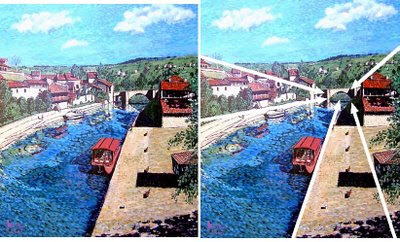
Pigeonniers were therefore usually extremely ornate and elaborate constructions designed to demonstrate social position and authority. Just like expensive cars have become a status symbol today, and keeping up with the Joneses means buying a new Jag or Merc every couple of years, in those days the Fat Cats needed bigger and flashier pigeonniers to show their position in the social pecking order. A by product was the very valuable pigeon fertiliser which was usually included as part of one’s estate, so that on dying, you were worth so many bags of pigeon dung on top of all your other assets.

In the nineteenth century the keeping of pigeons became universally permitted in France and in many cases pigeonniers were then incorporated into domestic dwellings, whether over gatehouses, in lofts or courtyards or as towers which buttress the perimeter walls of chateaux or large country houses.

But it’s the stand-alone pigeonniers you see all over France that really intrigue me, because of the way they mirror the mainstream regional or departmental stylistic and architectural differences. Sometimes in stone, sometimes colombage, sometimes brick and quite often on pillars making them look like a backdrop to a “Doctor Who” episode.

Fortunately, almost all were spared the 25 years of Revolutionary vandalism, which followed the Terror after 1789. This means that long after they’d stopped chopping off the heads of the royals and nobles, the French can still chop the heads off a few pigeons for the table.

There are always a few pigeonniers on show at La Petite Galerie in Mezin. Visitors are always welcome - entry is free - and you can also visit my studio if you like.

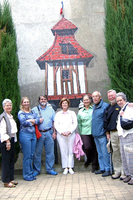
The pics above show:
Jim Gensheer and his group who come regularly to Gascony
Ray with a pigeonnier and Almond Falliers out hunting.

Armand Falliers? Who's he?

He was the President of Fance from 1906 to 1913. And he was born our village of Mezin. (Much more on him later).

* A LITTLE BIT OF THEORY - 4


POSITIVE AND NEGATIVE SPACES

When you look at anything, your eye sends your brain a complex series of messages which allow you to cope with your environment. The picture you see in your mind is composed of positive and negative areas. The positives are usually objects, such as a bowl of fruit and a book on a table situated next to a wall within a room, and the negatives are the spaces around these objects, such as the areas which separate the fruit, the shape between the bowl of fruit and the edge of the table and the distance the table is from the wall and where the wall joins the floor and the ceiling.

In art, the negative spaces are as important as the positive ones. Look carefully at the negative spaces because they will help you to see and understand the objects they surround more clearly, and this means that when you draw the positive item, your drawing will be more accurate.

Remember that you are translating three dimensions into two dimensions. Where, in reality the objects you are drawing take up space, on your paper they become flat areas or shapes. This means that your drawing will appear more accurate and convincing if you look carefully at - and are able to translate faithfully onto the paper - the relationships between the components of your picture. This means both the positive shapes (the objects) and the negative spaces around them.

When you draw the bowl of fruit and the book, look at and draw the shape of the areas between the fruit as well as the fruit - look at and draw the shapes that separate and surround the bowl and the book - look carefully at the shape of the table surrounding the bowl and the book - and look at and draw the shape of the wall around the table. These negative shapes are as important as the positive items they surround - so turn them into positive areas in your mind.

In the example of the PIGEONNIER above, in order to get the shape of the roof, the sides and the pylons it rests on as accurately as possible, you have to look at the negative shape of the sky in the areas marked (A) - and the shape of the brickwork in area (B) when you are drawing the positive outlines that make up the building.

The object of the exercise is to evaluate as accurately as possible the relationships between all the objects you are drawing and to transfer them onto your paper as exactly as possible.

These relationships lead on to composition.

Drawing Exercise 2


OBJECTIVES:

* to focus on negative spaces while drawing.
* to highlight the importance of looking carefully at what you are drawing.
* to sharpen your drawing skills.

If you succeed in creating an interesting drawing out of something ostensibly everyday, so much the better.

Method

Choose any chair as your subject. The simpler the better - a cheap, outside, plastic, stacking chair is perfect, but any chair will do.
Please, please use a decent size piece of paper.
Draw a frame before you start.
Sit quite close to the chair and draw it to fill the frame, paying particular attention to the NEGATIVE SPACES.
Let your chair extend BEYOND the frame on all four sides.
Erase those parts of your chair that jut out of the frame.
Using a soft, dark pencil, shade in the NEGATIVE SPACES. Make these shaded areas as dark as you can. (It may help to start in at the top left of your drawing. Try to keep the heel of your hand off the paper to prevent smudging).
If necessary, darken the outline again.
When you are finished, add your name and date.

* A LITTLE BIT OF THEORY - 3.


Above: Ray's copy of Van Gogh's "Church at Auvers".

WHAT TO KEEP IN AND WHAT TO LEAVE OUT

Artists have a tendency to add order to what they see - this usually means leaving out superfluous detail when composing their picture – and ‘tweaking’ the things they find interesting or important to give them more importance in the composition.

Before you start, you will probably have some idea of what you want to achieve. (If not, look at other artists’ paintings in art books for inspiration or look at photographs or the things around you that capture your interest).

You may decide that you want to create a landscape or a flower study or a portrait or something abstract.

But always remember that you are not creating reality - rather you are creating an illusion of reality. This means that too much detail may have a tendency to clutter your painting or drawing and you must train yourself to leave unnecessary details out of your picture.

Start off by looking carefully at the subject. Then do your best to transpose what you see as accurately as you can onto your working surface. However, you may not necessarily need to capture every detail of every petal or leaf in a flower study for example. Exact details of a fabric pattern on the subject’s shirt - or every facial line - may not be required in your portrait. It would be impossible to capture the details of each roof tile in a painting of a village or building.

So look for the essentials, and leave out unnecessary detail. Eventually you will develop your own formula or convention to represent these features.

This does not mean that there’s no need to look very carefully at what you are painting or drawing. Accuracy is vital and this step will govern all subsequent stages as well as the final result.

At a later point in your development you may wish to distort the shapes or colours, but in the beginning you should try to capture your subject as accurately as possible.

(In my copy of Van Gogh's church, I've left out the figures in the foreground because I was more interested in the building, the colours and the post-impressionist style. But in the original, it is obvious that Van Gogh was not that interested in the building per se. He wanted to catch the emotion of the day, the amazingly intense and emotional colours - and he was quite happy to forsake architectural detail to achieve this).

* ART HOLIDAYS AT LA PETITE GALERIE


The above photos show some happy artists painting a nearby chateau and the art holiday accommodation at La Petite Galerie.

Everyone can paint or draw. Even those of you who think you "can’t even draw a stick figure” will be surprised at the inherent talent that’s just waiting to be tested.
Naturally it’s easier with someone who has had some experience in “teasing out” the artistic capabilities of people who would like to try.
You can learn to paint and draw at La Petite Galerie in sunny Gascony. We offer a six day live in course with all meals provided. For full details please email Ray at:
ray@johnstonesinfrance.com

Tuesday 27 January 2009

Drawing Exercise 1.


Here's a simple drawing exercise for those who would like to while away a few minutes.

OBJECTIVE: To create the impression of a three dimensional object on a flat surface.
Start with a decent sized piece of paper (a).
Take a small box and place it in a strong light - sunlight or a desk lamp.
Draw only the outline planes of the box (b, c and d), ignoring any detail on its sides), but carefully shade the shadow, working it up into a nice strong dark grey or black.
The object of the excercise is to carefully look at and transpose onto your paper the parallel lines that make up the sides of the box and the shadow - and to create the impression of VOLUME when you draw the shadow.
If you would like to make this exercise a little more challenging, using your pencil, you could ‘colour in’ the sides of the box, giving each one a slightly different tone, with the actual cast shadow being the darkest.

* A LITTLE BIT OF THEORY - 2


Look at these happy guests with their paintings - but they all started by creating a frame.

CREATING A FRAME

Before you pick up a pencil or brush, and before you make even the tiniest mark on a piece of paper, it is important to remember what an impression presentation can make. In the same way as framing creates a whole new dimension for an oil or acrylic painting, a decent white border will give a much smarter look to your drawing or water colour. Then, if you choose to frame it as well, the slickness of your presentation is further enhanced.

So, I always recommend a border of at least 3-4 cms on all sides of the paper. This is best achieved by using a strip of good quality masking tape. You will be surprised what sparkle is added to your efforts when you peel off the tape when you’ve finished. (If you feel you’ve got enough control, you may prefer to draw the border with a soft pencil and work within it. When you rub it out afterwards, the result is the same, if a little less dramatic, at the end).

Choosing the right kind of paper is also part of presentation, and, although I don’t recommend spending a fortune on handmade sheets of fine paper for everything you do, you will avoid disappointment if you choose reasonable stock for watercolours and for drawing.

Your own attitudes and style will help you decide whether to use rough or smooth sheets of paper, and you will probably vary across a range of textures, depending on the subject matter, but I believe that watercolours should never be done on paper less than 200 gms, and preferably 300 gms. Remember that the heavier the stock, the less likelihood there is of the paper buckling and stretching to form pools and mounds where the watercolour pigment is more difficult to control. Drawings can be done on lighter paper, but again, the heavier and more durable the weight, the easier it is to control - especially when using heavier leads to create darker colour or strong textures, and when framing.

Size is equally important, and, although a case can sometimes be made for small works, my recommendation is that you should never bother with any size under A4, and the smallest paper for a watercolour should be at least A3, preferably larger. When you are creating textures and washes you will find it is much easier to control the water and the pigment with larger paper.

Now that you’ve created a suitable area to work within, you can pick up your pencil.

* A LITTLE BIT OF THEORY - 1


LET'S START WITH THE BASICS


Before we start, I’d like to explain a few basics.

This blog begins with a summary of the points I give to guests who come to La Petite Galerie in southwest France on art holidays.

Please remember that it is by no means definitive – rather it is a broad ranging sweep across the vast area of art theory in the hope that we can arrive at a common language. This will help us to talk fluently about the basic elements of painting and drawing.

Please also bear in mind that it is a personal summary. This means that I emphasise and focus on points that I believe are important. You may have other ideas, so I apologise in advance for what you may feel are errors of omission.

Art theory can be a very complex subject, but I hope we can distill down a few complex issues into key points to keep in mind when you are involved in picture making.

These key points are not intended to be used as a formula, but try to think about the ones that interest you most and use them whenever and wherever possible. You will be surprised at how easy it is.

Finally, don’t feel intimidated if you don’t understand some of the theory – or if you forget the technical terms. Just talk about art as you would about any everyday subject.

In case you're wondering, that's a pigeonnier in the water colour at the top of the page. It belongs to Patti and Lee from Florida , USA.